


Buy n’ Save
Areas
UX/UI design
E-commerce
Prototyping
Overview
Buy n’ Save is a wholesale company dedicated to simplifying customers' daily lives by offering a curated bundle of essential disposable household items—everything needed for the month, all in one convenient package. To enhance the shopping experience, they are launching an online platform, allowing customers to purchase their bundles effortlessly and have them delivered straight to their doorstep.
Role & Contribution
As the UX/UI Designer, my role was to transform the provided copy into a visually engaging and intuitive interface. I crafted a seamless user experience by integrating thoughtful animations and micro-interactions, bringing the design to life in a polished, high-fidelity prototype.
Gallery
Take a glimpse at the deliverables crafted for the project.


Design process
Presented below is the comprehensive documentation detailing the design process behind the Buy n’ Save e-commerce.
1 - Brand, Copy & Wireframe
2 - Style Guide
3 - Desktop & Mobile designs
4 - Animations
5 - Prototype
6 - Documentation & Hand-off
7 - Conclusion
1 - Brand, Copy & Wireframe
Before initiating the design phase, I engaged with key stakeholders to align on product objectives, user needs, and business requirements. Equipped with brand assets, a comprehensive user research report, and a structured copy alongside a foundational wireframe, I focused on enhancing the information architecture, interaction flows, and visual hierarchy. My role was to translate their strategic vision into a pixel-perfect, high-fidelity prototype optimized for usability, accessibility, and seamless developer handoff, ensuring a scalable and intuitive user experience.
It’s important to note that the checkout flow was managed externally through the payment provider’s interface, eliminating the need for a custom design. This constraint informed the user journey mapping, ensuring a seamless transition between the platform and the third-party payment gateway without disrupting the overall experience.


Website Copy and Wireframe provided. Source: Buy N’ Save
2 - Style Guide
Utilizing the provided brand assets and the Material 3 Design System, I established a scalable design foundation by developing a streamlined yet comprehensive style guide. This systemized approach ensured visual consistency, typographic hierarchy, and component cohesion across the interface, optimizing the design for usability, accessibility, and seamless handoff to development.

Style guide. Source: Marcelo Ambiel
3 - Desktop & Mobile Designs
Leveraging the provided wireframe and design system, I explored multiple layout variations for both desktop and mobile, ensuring scalability and consistency across breakpoints. Following an initial usability test, I synthesized user insights to identify friction points and optimize the interface for clarity, accessibility, and engagement. Iterative refinements based on qualitative feedback and behavioral analytics informed the final high-fidelity design, now ready for implementation.

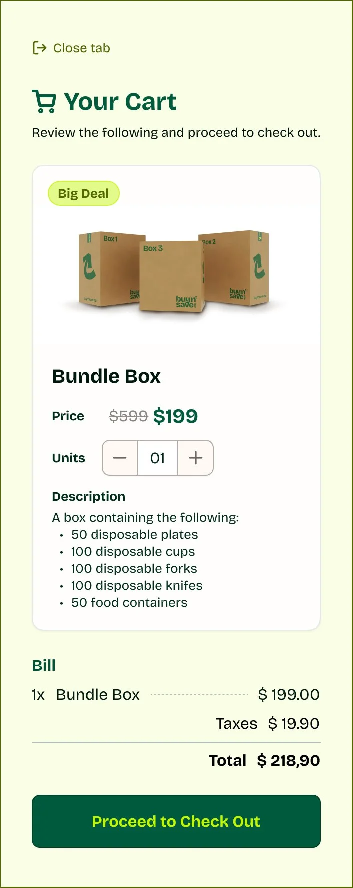
Buy N’ Save cart modal. Source: Marcelo Ambiel.
Buy N’ Save mobile. Source: Marcelo Ambiel.

Buy N’ Save desktop. Source: Marcelo Ambiel.
4 - Animations
Hero animation and micro-interactions. Source: Marcelo Ambiel
The client required a predominantly static website with two key motion elements: an unboxing animation to showcase the bundle’s contents and a dynamic spinning seal in the hero section. Collaborating closely with the development team, we conducted a feasibility assessment to balance performance, usability, and visual impact. To optimize implementation, we integrated the unboxing sequence as a background animation, layering UI components dynamically to maintain clarity and responsiveness. The final motion design execution is showcased below.
Box animation complete. Source: Marcelo Ambiel
5 - Prototyping
With the UI finalized and motion elements implemented, I developed a high-fidelity interactive prototype to simulate real-world user interactions. This enabled usability testing across mobile and desktop, allowing me to gather insights. Based on user feedback, I iterated on key interaction patterns, optimized design heuristics, and refined micro-interactions to enhance usability and engagement before final handoff to development.
Buy n’ Save desktop prototype. Source: Marcelo Ambiel
Buy n’ Save mobile prototype. Source: Marcelo Ambiel
6 - Documentation & Hand-off
To ensure scalability and maintain design consistency for future iterations, I meticulously documented the design system, encompassing the style guide, reusable components, and interaction patterns. This documentation detailed all possible component states, behaviors, and edge cases, providing a comprehensive reference for both design and development teams.
To streamline the handoff process, I embedded detailed design specifications within the Figma file, establishing it as a single source of truth for developers. This included pixel-perfect layouts, spacing guidelines, and interaction details to minimize ambiguity and accelerate implementation.
The handoff was conducted via a team call, where I walked through the entire design system and interactive prototype, explaining key user flows, microinteractions, and potential edge case scenarios. I also ensured an open communication channel through our project Slack workspace, making myself available for any follow-up questions to facilitate a smooth and efficient implementation.

Buy n’ Save Style Guide. Source: Marcelo Ambiel

Buy n’ Save Components. Source: Marcelo Ambiel

Project notes inside Figma for handoff. Source: Marcelo Ambiel
7 - Conclusion
The successful launch of Buy n’ Save’s e-commerce platform demonstrated the tangible impact of user-centered design and strategic UX execution. Key results included:
22% reduction in time-to-purchase – Streamlined IA and intuitive navigation minimized decision fatigue, validated through post-launch session analytics.
95% design-to-development parity – Comprehensive documentation and component-driven workflows reduced engineering back-and-forth.
Scalability for future product lines – The modular design system enabled rapid iteration, supporting any future product verticals
Beyond metrics, the project reinforced the importance of cross-functional collaboration—aligning UX, business goals, and technical constraints—while proving that even limited-scope projects (like outsourced checkout flows) can deliver seamless experiences through service design thinking.

Buy n’ Save Mobile screens. Source: Marcelo Ambiel